Home
| About
| Mine Tracker
| RSS
| Footer
▄▄▄▄▄▄▄▄▄▄▄▄▄▄▄▄▄▄▄▄▄▄▄▄▄▄▄▄▄▄▄▄▄▄▄▄▄▄▄▄▄▄▄▄▄▄▄▄▄▄▄▄▄▄▄▄▄▄▄▄▄▄▄▄▄▄▄▄▄▄▄▄▄▄▄▄▄▄▄▄▄▄▄▄▄▄▄▄▄▄▄▄▄▄▄▄
█▄▄░▄▄█░▄▄▀█░▄▄▀█▀▄▀█░▄▄███░▄▄▀█░▄▄▀█░▄▀███▄▄░▄▄█░▄▄▀█░▄▄▀█▀▄▀█░▄▄█░▄▄▀█░▄▄▀██▄██░███▄██▄░▄█░██░
███░███░▀▀▄█░▀▀░█░█▀█░▄▄███░▀▀░█░██░█░█░█████░███░▀▀▄█░▀▀░█░█▀█░▄▄█░▀▀░█░▄▄▀██░▄█░███░▄██░██░▀▀░
███░███▄█▄▄█▄██▄██▄██▄▄▄███▄██▄█▄██▄█▄▄██████░███▄█▄▄█▄██▄██▄██▄▄▄█▄██▄█▄▄▄▄█▄▄▄█▄▄█▄▄▄██▄██▀▀▀▄
▀▀▀▀▀▀▀▀▀▀▀▀▀▀▀▀▀▀▀▀▀▀▀▀▀▀▀▀▀▀▀▀▀▀▀▀▀▀▀▀▀▀▀▀▀▀▀▀▀▀▀▀▀▀▀▀▀▀▀▀▀▀▀▀▀▀▀▀▀▀▀▀▀▀▀▀▀▀▀▀▀▀▀▀▀▀▀▀▀▀▀▀▀▀▀▀
Visualizing Ship Movements with AIS Data
https://www.beautifulpublicdata.com/visualizing-ship-movements-with-ais-data/
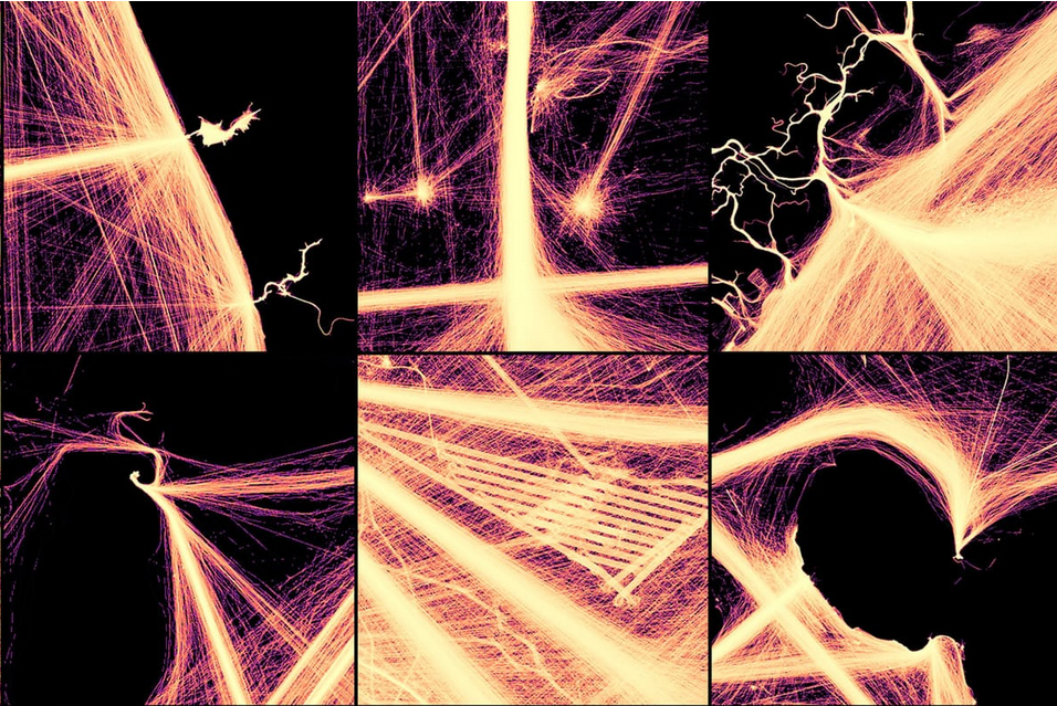
Using NOAA’s “Marine Cadastre” tool, you can download 16 years’ worth of detailed daily ship movements (filtered to the minute), in addition to “transit count” maps generated from a year’s worth of data to show each ship's accumulated paths.
I downloaded all of 2023's transit count maps and loaded them up in QGIS to visualize this year of marine traffic.
The resulting maps are abstract, electric and revealing. . When you remove the landmasses from the map and leave only the ship traces, the lines resemble long-exposure photos of sparklers, high-energy particle collisions, or strands of illuminated fiber optic wire. However, when you reveal ports, harbors, islands, and ferry lines, the ship traces take on meaning and order.
https://www.beautifulpublicdata.com/visualizing-ship-movements-with-ais-data/
Using NOAA’s “Marine Cadastre” tool, you can download 16 years’ worth of detailed daily ship movements (filtered to the minute), in addition to “transit count” maps generated from a year’s worth of data to show each ship's accumulated paths.
I downloaded all of 2023's transit count maps and loaded them up in QGIS to visualize this year of marine traffic.
The resulting maps are abstract, electric and revealing. . When you remove the landmasses from the map and leave only the ship traces, the lines resemble long-exposure photos of sparklers, high-energy particle collisions, or strands of illuminated fiber optic wire. However, when you reveal ports, harbors, islands, and ferry lines, the ship traces take on meaning and order.